Information

Detta är testmiljön för UC.se. Klicka här för att nå UCs publika webbplats.

Design Guidelines

Introduction

UC is Sweden’s leading provider of digital business and consumer information services. Since 1977, we have been collecting and converting data and information into analyzed data models and insights used in interactions between people, companies and society.

Our services help businesses and consumers in their daily decision making processes, such as financial processes and sales and marketing processes. We help many different
industries, the largest of which are banking and finance, small businesses, the retail trade and the service industry.

UC is part of the Nordic knowledge company Enento Group, which had a net sales of 146 MEUR in 2019, and 420 employees in eight locations in Finland, Sweden, Norway and Denmark.

Our brand strategy

We want to be perceived as a trustful, modern and innovative partner, by offering datadriven solutions and a customer experience with the highest service and quality with a personal touch.

How to implement our brand strategy

Our visual identity will revive and visualize our brand strategy and make it easy to recognize UC and other services that are a part of Enento Group. We also need to use the right kind of tonatality and images and behaviors in order to succeed with this new brand strategy.

In order to create a uniform impression of all communications material, it is important that we follow the fixed frameworks and guidelines described in this manual.


Download Enento Group Brand manual

See design system in Figma

Logotype

Our logo is one of the most important representatives for us and our company UC. It forms the basis of UCs visual identity and will be used as a sender in all our communications. Therefore, it is important that we treat the logo consistently and carefully. A logotype must never be redrawn or distorted. Always use the original logotype that are created. In text, our company names are printed as, UC. The logo and the symbol must not be used in continuous text.

Download our logos as .zip

UC

The logo is used in its original color, Ocean and black or Ocean and white, or in 100% black or white. It is also possible to display the logo in the Group’s primary colors and tones. In these cases only as a single-color logo.

Primary logo with black or white text.
Positive (black) logo is used only when  color is not allowed.
Positive (black) logo is used only when
color is not allowed.
Negative (white) logo may be used against all colors in our toolbox but is most suitable for dark tones.
Example of a single-color logo in the primary color palette. Consideration must be given to contrast and color choice of background.

SIZE

When using the logo one should keep in mind clarity. The minimum allowable dimension for each logo is listed here. Readability varies between different backgrounds and materials. Size under recommendation may be too unclear to be used. The logo is made to work both great as small but in extreme situations it may need to be taken produced a customized version for the purpose.

guidelines

In order for the logos to be perceived clearly, it should always be surrounded by a free zone, a minimum distance to another graphic, text, image, or component. The more free space around the logo, the more clearly it appears.

The smallest free surface around the smallest logo is 24px, but is based on the size of the logo itself. For instance in our desktop header we use 24 px top and bottom, and 32 px to the right for a logo that is 32 px high.

guides

Additional group identity in logotype.

If there is a need to be able to demonstrate the group affiliation, a logotype has been created for this. Examples of such events are representation at, for example, fairs, events or speaker presentations. It is most important that it does not replace the basic logo but is used sparingly and at the right occasion. For web it will be used:

  • In the boilerplate and in the bottom of our websites 
  • Also, in all customer communication and in newsletters: ”part of” will be used in the bottom.

In order to clarify group identity the byline ”Part of Enento Group” will be used in corporate material but not in sales material or in campaingns. Placement is free/ standalone and not ecessarily close together with brand logotype.

Primary logo with black text.
Primary logo with black or white text.
Primary logo with white text.

Colors & tones

Our graphic identity contains a number of colors that we divide into primary and secondary colors. Black, white and every primary color are the main colors. These colors, together with our other colors, should primarily be used for brand recognition.

We use the primary color together with the secondary colors to create more joy and depth in our visual design. But always subordinate to this. Examples of use may be as an accent color in typography, in diagrams, inside a binder, profile mug or bag. The colors should as far as possible be used in 100%, but tones in different colors can also be used to create variety.


Primary Colors

Ocean blue
Ocean +1

RGB    (0 71 85)

HEX     #004755

Ocean

RGB    (0 142 170)

HEX     #008EAA

Ocean -1

RGB    (42 199 212)

HEX     #8EC7D4

Ocean -2

RGB    (221 238 242)

HEX     #DDEEF2

Ocean -3

RGB    (236 247 249)

HEX     #ECF7F9

Ocean Bg

RGB    (240 246 248)

HEX      #F0F6F8

Sand
Sand +1

RGB    (96 71 49)

HEX     #604731

Sand

RGB    (141 100 67)

HEX     #8D6443

Sand -1

RGB    (190 140 100)

HEX     #BE8C64

Sand -2

RGB    (220 200 175)

HEX      #DCC8AF

Sand -3

RGB    (245 234 227)

HEX     #F5EAE3

Sand Bg

RGB    (250 247 241)

HEX     #FAF7F1

Gray scale
Black

RGB    (0 0 0)

HEX     #000000

Nightrider

RGB    (51 51 51)

HEX     #333333

Emperor

RGB    (85 85 85)

HEX     #555555

Gray

RGB    (132 132 132)

HEX     #848484

Silver

RGB    (192 192 192)

HEX     #C0C0C0

Gallery

RGB    (234 234 234)

HEX     #EAEAEA

Lightsmoke

RGB    (247 247 247)

HEX     #F7F7F7

White

RGB    (255 255 255)

HEX     #FFFFFF

Secondary Colors

Fire
Fire +2

RGB    (122 74 17)

HEX     #7A4A11

Fire +1

RGB    (191 114 20)

HEX     #BF7214

Fire

RGB    (243 146 0)

HEX     #F39200

Fire -1

RGB    (249 199 138)

HEX     #F9C78A

Fire -2

RGB    (255 239 219)

HEX     #FFEFDB

Typography

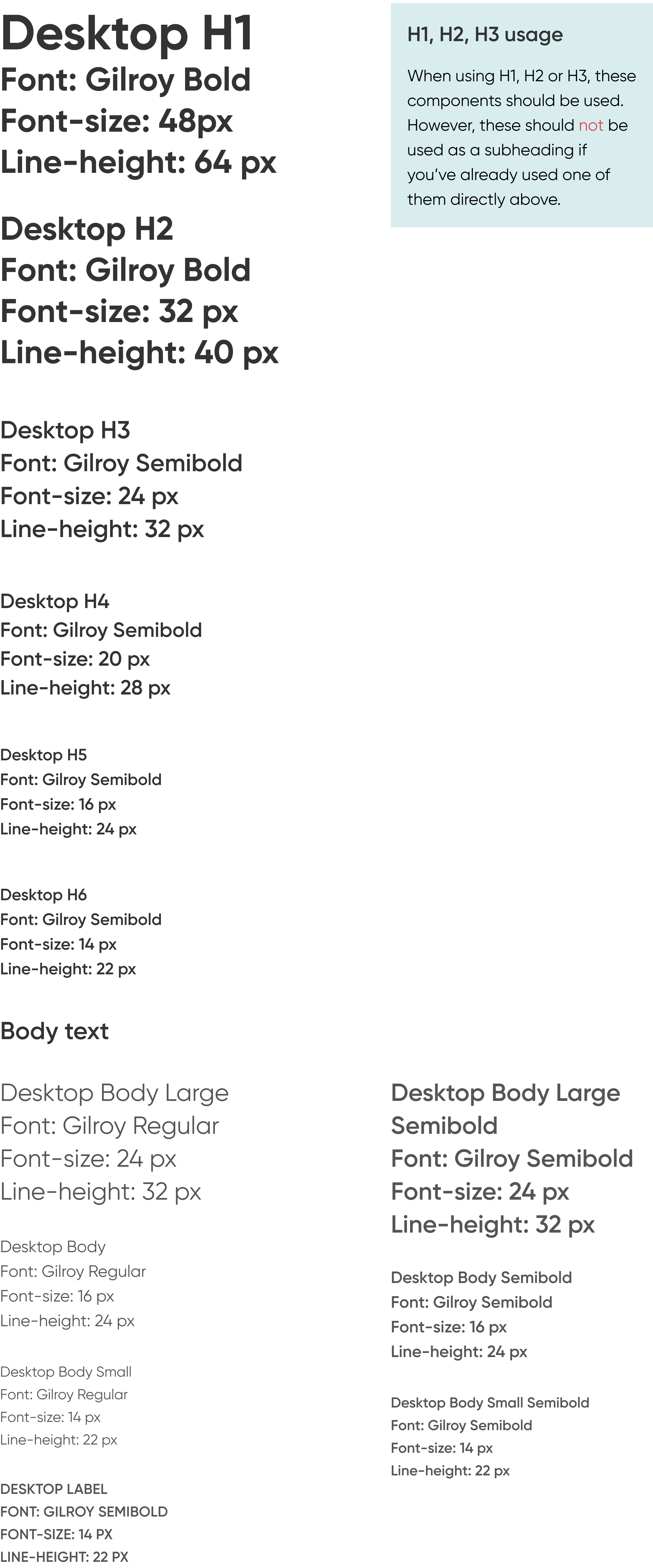
UCs typography consists primarily of the font family Gilroy. Gilroy creates a modern expression, with its straight cut and round shapes it gives a clear yet warm impression. With a number of fixed principles for how the different fonts are handled, we gain strong recognition with our typography. This is how we use Gilroy in the UC products.


Headings

typography

Imagery

A picture says more than a thousand words the saying goes. Sure, it’s true. Within the Enento Group, we strive to create recognition in everyday life, at work or in various situations through our imagery. We want to convey warmth and humanity at the same time to show the Nordic which is our primary market.

When using images and illustrations, they may have different purposes, so we have divided the pictures into three image categories:

  • Brand images
  • Service images
  • General images

Brand images

These are pictures used when we want to build and enhance the image of the group or company. Also when we speak in general, customer offerings at a higher level and to build the group and company in a strategic and brand level. This section consists of a few selected images that are available in a number of variants and tones.

future
cliff lookout
peace
girl overview
peace
Examples of brand images.
girl overview

Services images

Used when we speak specific products or services, and the product / service has a clearer place rather than in a bigger perspective.

The images should feel warm and contain a large amount of recognition to achieve relevance. We use people in everyday situations or subtle images to build the right feeling.

The images are for example used on web site, email newsletter and annual report. Local Brand pictures describe our services and their availability, benefits, our customers and their needs.

pair programming
omatieto
Examples of services images and usage on site.

General images

Here we can use almost any pictures as long as they are relevant to the content and as long as they have a Nordic, personal and warm touch. Used in for examples newsletters, social media, articles and ppt presentations.

fist bump
girl by the window
family
Examples of general images.
lady with tablet


Download Brand images.zip (11,6 mb)